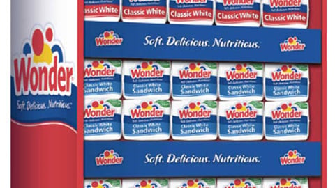
Kansas City, Mo. -- Interstate Bakeries Corp. has partnered once again with Willoughby Design to redesign Wonder Bread's iconic red, yellow and blue packaging in an effort to appeal to consumers of all ages.The well-known, colorful balloon design that has distinguished Wonder Bread from other brands for more than 80 years has been tweaked to include contemporary typography and a more horizontal logo to target a slightly older consumer. The new design also introduces the simple and health-related tagline, "Soft. Delicious. Nutritious." It marks the first time in the brand's history that a tagline has been included on its packaging. The change was also made in order to provide cohesiveness in both design and branding across a wide variety of Wonder products. "We looked at this change as more of an evolution rather than a revolution," explains Anne Simmons, brand strategist at Willoughby Design, also in Kansas City. "Targeting the mom with kids has always been the heart and soul of this brand. It was a kid's bread. They now wanted to create a stronger appeal with the entire family."Consumer research on the new design included qualitative studies on what designs felt right to long-time consumers, and quantitative studies that included an online shopper simulation where consumers reported what their eye was drawn to on a virtual shelf. Willoughby Design developed sales brochures, FSI coupons and P-O-P materials (such as floorstands) to create a unified presence across all consumer touchpoints."In case people were getting confused, we wanted to make sure we had these promotional pieces ready to use at both the stores' and markets' discretion," Simmons says.The new branding has made its way onto more than 50 varieties of bread, buns and dinner rolls since officially launching in all markets in December 2008. The third and final phase of the rebranding is said to launch next month as the design is rolled out to include the expanding Wonder Bread food line. "Establishing a cohesive look would help to create somewhat of a billboard on the shelf for Wonder Bread," says Simmons. "This also plays into Wonder Bread's goal to easily reach their target customer on every shelf. They know who she or he is, how they shop and their instincts when it comes to meal planning. All of this knowledge played a part in the redesign."The project began in late April 2007, when Wonder Bread came to Willoughby Design looking to make an impactful change on the shelf to appeal to a broader audience. Before that, the company worked with the brand in 2005 on an identity update campaign to bring consistency to the brand -- some elements had not been changed since the 1970s. "The question was how we could keep those recognizable red, yellow and blue balloons but give them more of an adult feel," explains Simmons. "We wanted to make sure the name Wonder still stood out on the store shelves, so we placed the balloons more in the background. Changes needed to be made, but we certainly didn't want those changes so drastic that the brand would get lost on the shelf."Simmons says she is not aware of any additional advertising planned for the repackaging. Wonder Bread execs would not comment on this or any other portion of this story.