P-O-P Showcase: Best-in-Class Displays, CPG Products

With an opportunity to showcase their best work, P-O-P producers themselves submitted the following images based on editorial calls we made to our P2PI community.
Our latest display gallery, part 1 of a two-part report, presents a sampling of eye-catching and effective activations representing a variety of CPG products and categories — in a variety of retail environments. (Click on the images below to expand.)
Part 2 of this report, "Best in Class Displays, Beyond CPG," will publish later this month.
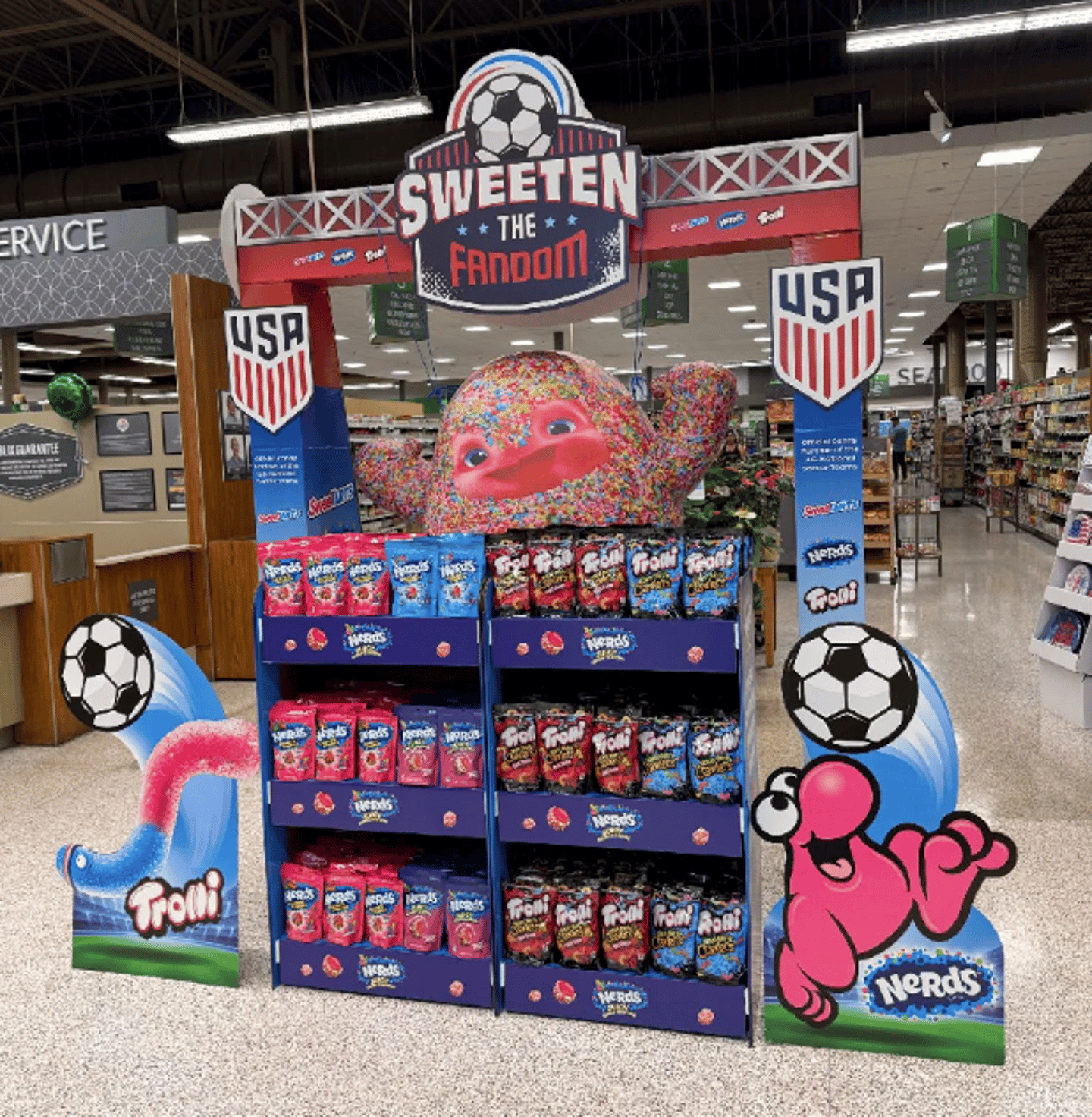
Brands: Ferrara's Nerds, Trolli, Sweetart
Display manufacturer: Menasha
Ferrara's FIFA World Cup 2026 retail activation leveraged a scalable, high-impact display platform (designed and produced by Menasha) to capitalize on excitement surrounding the event. Featuring a portfolio of Ferrara brands, the program transformed seasonal merchandising into an engaging shopper experience through bold soccer-themed graphics and strategic in-store placement. Designed for easy store-level execution and consistent deployment at scale, the displays increased brand visibility, encouraged product discovery and drove impulse purchases by connecting a major global sporting event with shopper purchasing behavior at retail.
P2PI perspective: The "Sweeten the Fandom" slogan and soccer-themed imagery is a strong emotional hook. The large, colorful, 3D-style characters have high visual impact.This "shoppertainment" potentially encourages social media sharing, which extends the brand's reach beyond the store.
Brand: Newell Brands' Yankee Candle
Display manufacturer: Smurfit Westrock
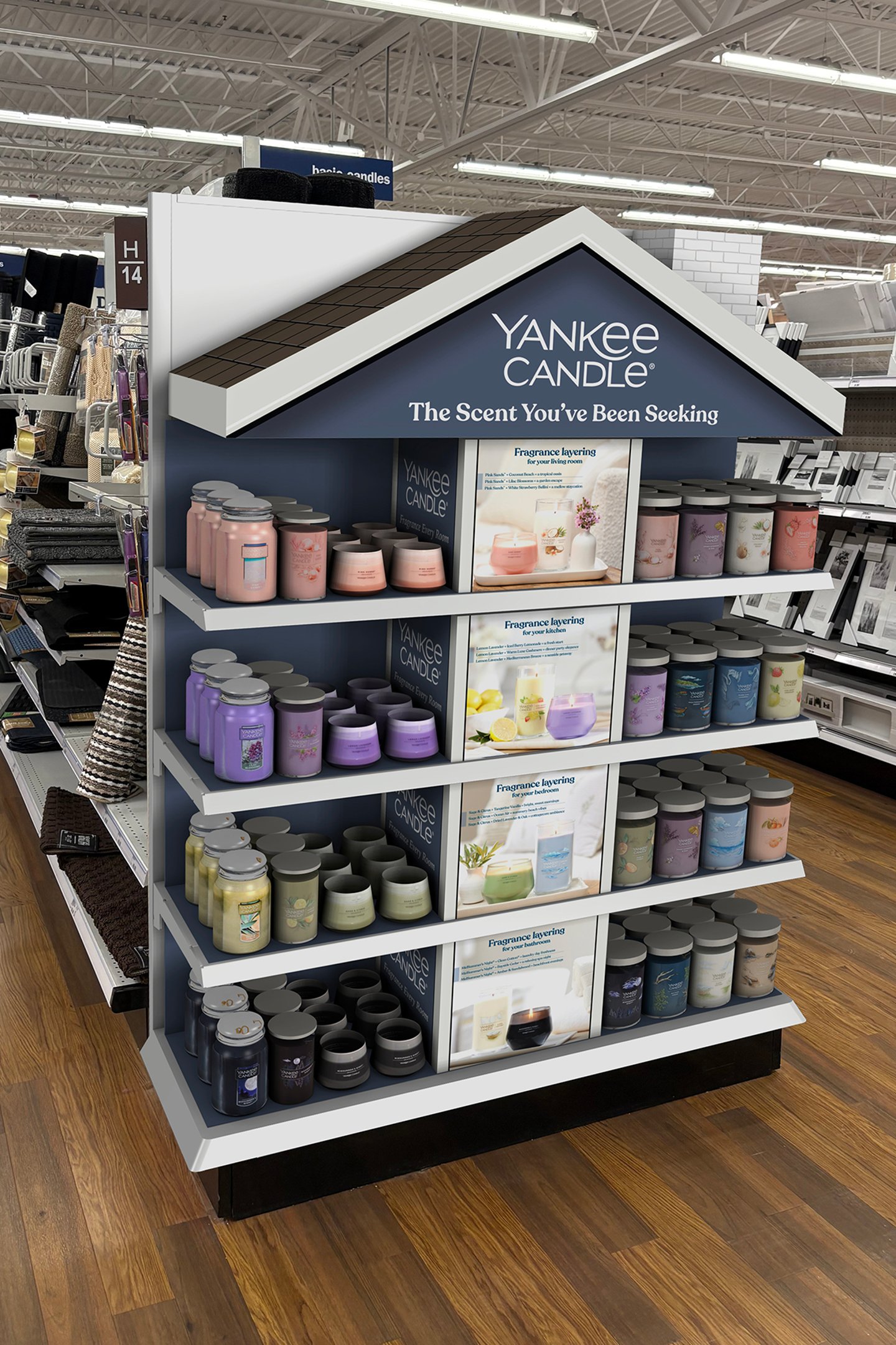
To help shoppers envision fragrance throughout the home, Yankee Candle partnered with Smurfit Westrock to transform a standard retail endcap into an immersive shopping experience. Featuring a house-inspired design with dimensional rooftop elements, room-themed graphics and organized fragrance collections, the display invited shoppers to explore scents by space and imagine them as part of everyday moments at home. The engaging design blended storytelling with intuitive merchandising to create a memorable retail destination, encourage product discovery and inspire multi-item purchases. The display delivered a 105% sales lift versus the previous year and demonstrated the power of experiential retail.
P2PI perspective: The product is neatly organized by color and type across four distinct tiers, making it easy for shoppers to browse. The inclusion of "fragrance layering" signage provides shoppers with usage ideas. The endcap maximizes visibility with strong branding.
Brand: Colgate-Palmolive's Hello
Display manufacturer: Smurfit Westrock
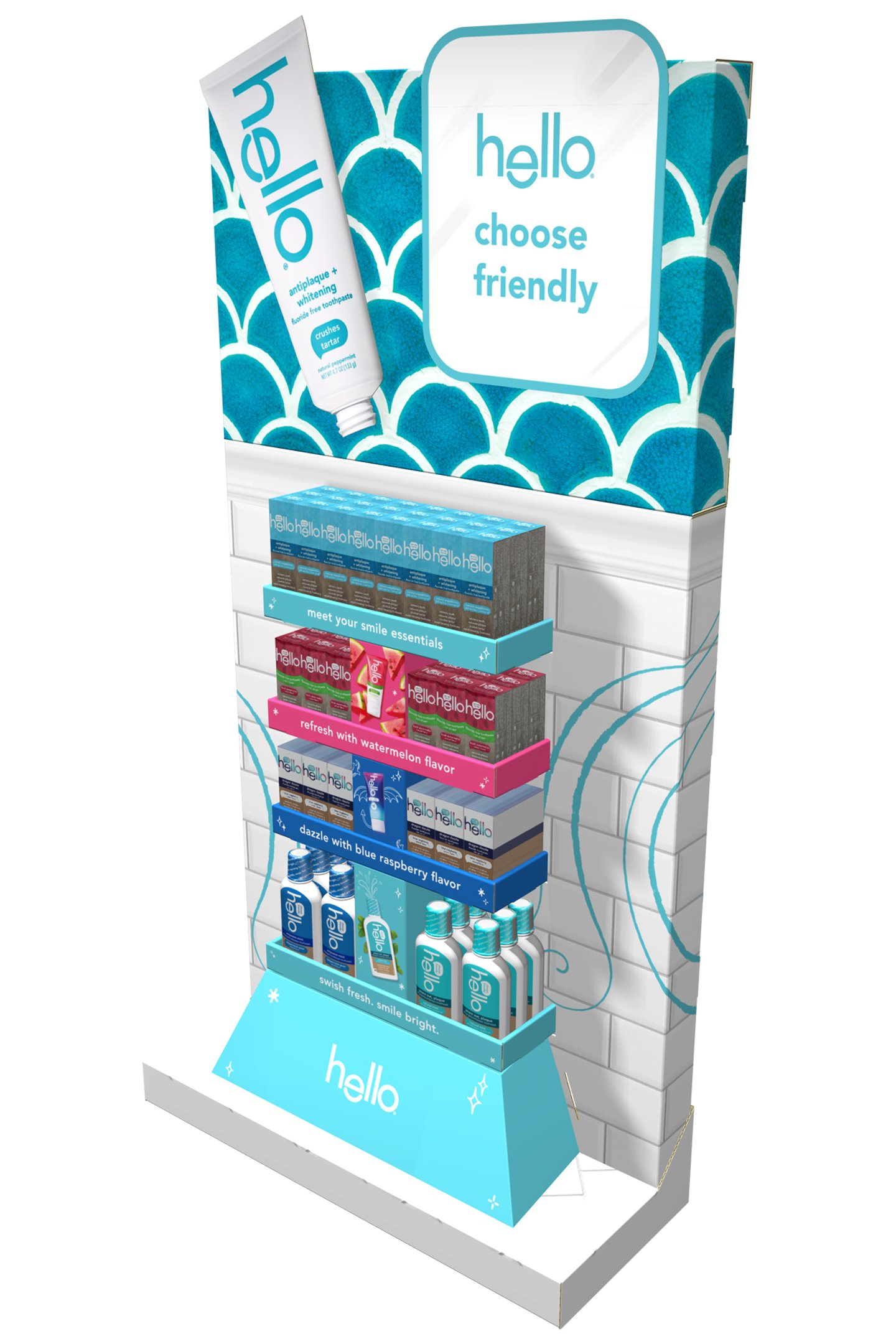
To showcase the vibrant personality of the Hello oral care brand, Colgate-Palmolive partnered with Smurfit Westrock to create this endcap display for a mass merchandise retailer. Designed to capture attention and bring the brand's vibrant personality to life, the display combined bold graphics, dimensional branding elements, elevated product presentation and a clean, modern aesthetic. The display reinforced Hello's approachable, natural identity while maximizing visibility and shopper engagement at shelf. It was engineered for efficient transport and retail execution.
P2PI perspective: This display offers a powerful brand identity. It uses color-coded shelving to help shoppers quickly distinguish between different product benefits and flavors. Each shelf level contains a concise call to action or benefit statement that guides the shopper's decision-making.
Brand: Harry's
Display manufacturer: Innomark
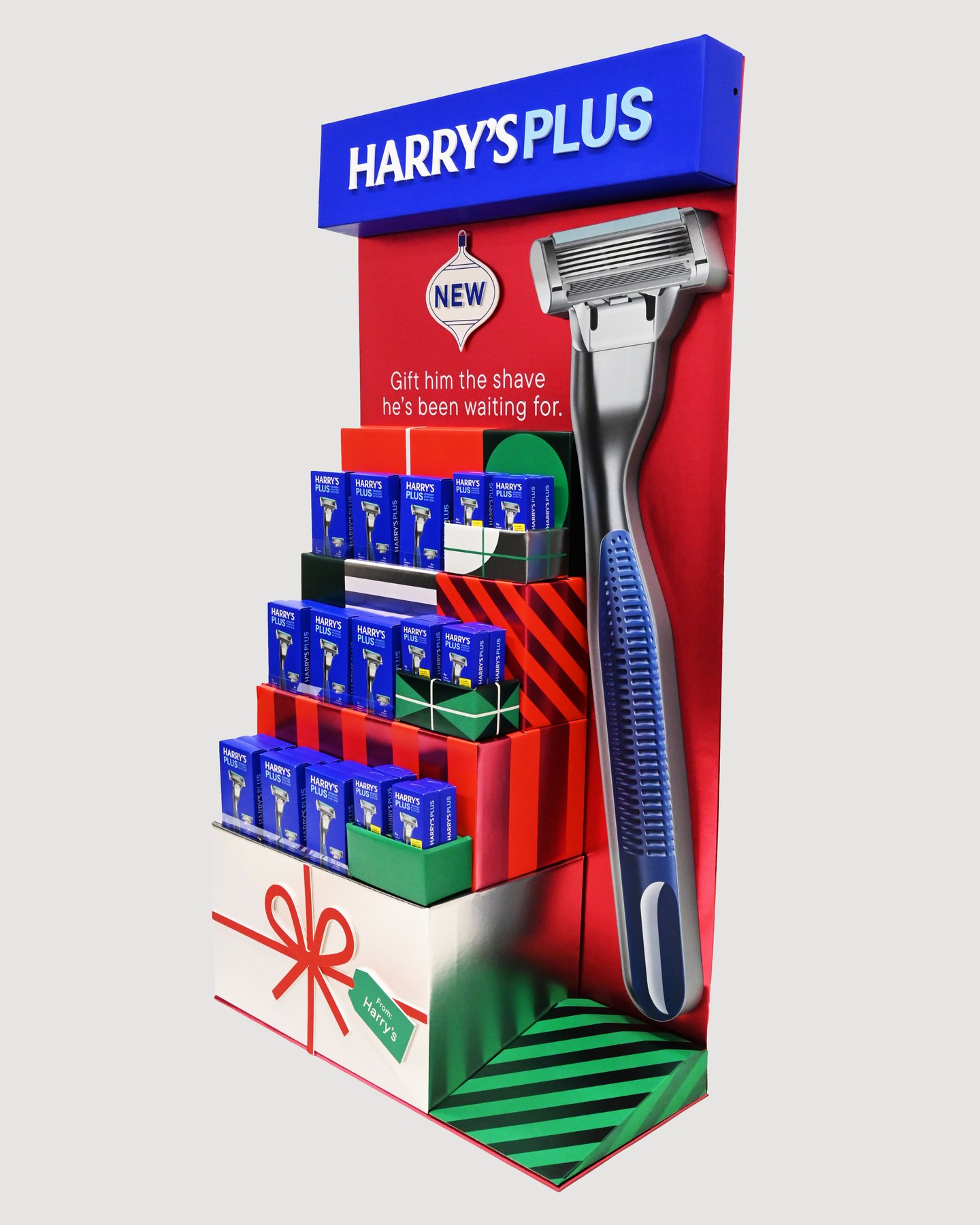
Mammoth Brands partnered with Innomark to deliver a unique and innovative holiday endcap to launch their Harry’s Plus razor. An oversized vacuum-form simulating the actual razor coupled with a large acrylic header made this eye-catching and gave the display great visibility from a distance. The printed foil graphic elements added to the holiday motif. Innomark produced, assembled and kitted the endcap with product, and the display was installed in 2,200 stores with incredible sales results.
P2PI perspective: This display has a strong visual focal point, and the "Gift him the shave he's been waiting for" tagline clearly positions the product as an ideal gift. The products are neatly tiered and organized by color and type, making it easy for shoppers to navigate the options.
Brand: No7 Beauty Co's Good Intent
Retail partner: Walgreens
Display manufacturer: TRG Packaging and Display Solutions
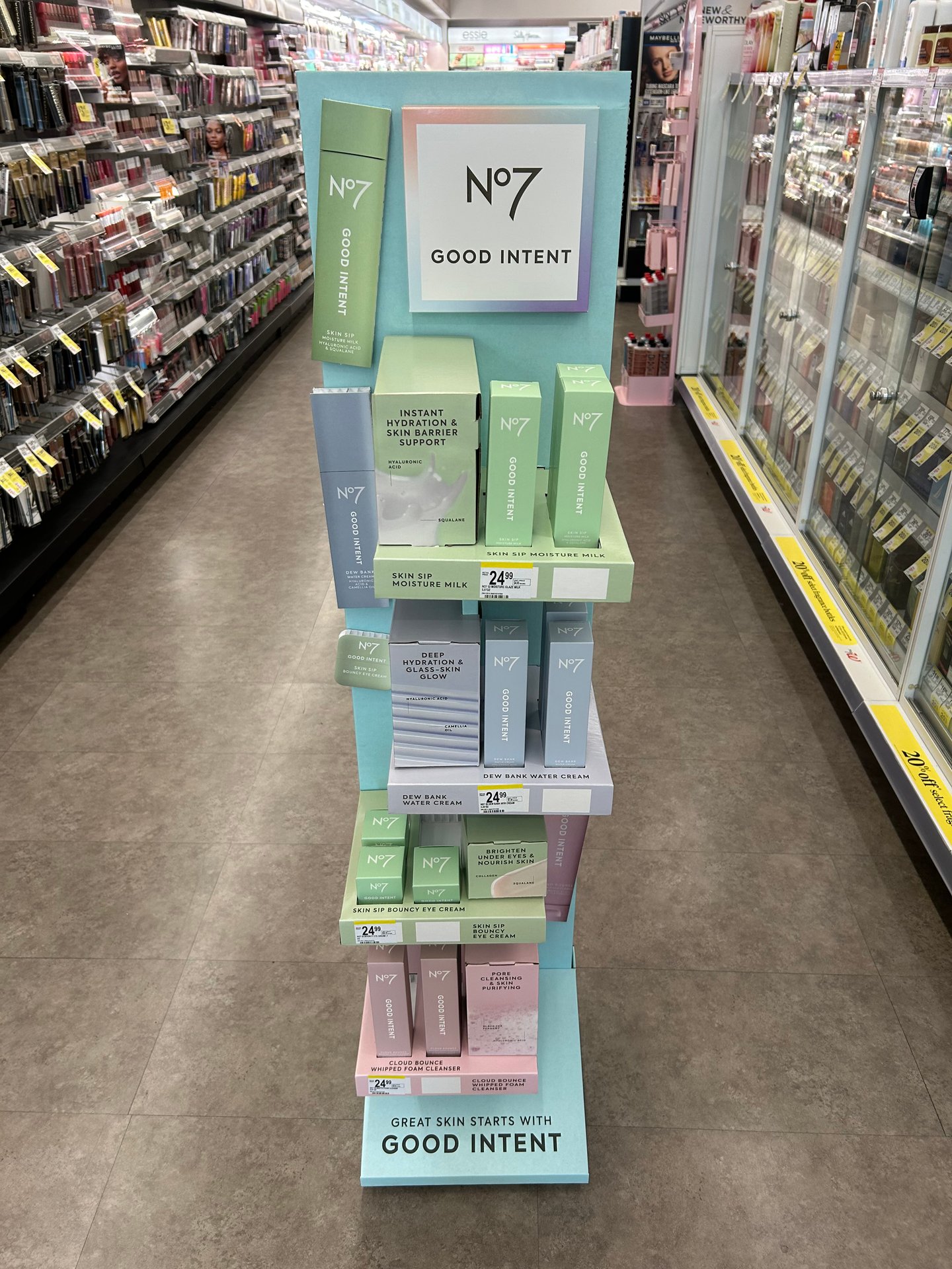
Good Intent by No7 Beauty Co. called for a floor display designed to make an immediate impact and differentiate the brand from competing products. Premium structural design, dimensional elements and sustainable materials elevate the brand while maximizing product visibility and shopper engagement. Built to last 12 months in the store, the durable corrugated display features an internal Falconboard structure for added strength and longevity. Plastic casters keep the corrugate off the floor, helping protect the display from everyday wear. The result is a durable, functional solution that helps the brand stand out, drive product discovery and encourage purchase.
P2PI perspective: The brand is prominently featured, and the "Great Skin Starts With Good Intent" tagline provides a clear, emotive message. The cohesive visual identity comprises a soft, pastel color palette. The display unit itself creates a clean, modern and clinical yet approachable aesthetic.
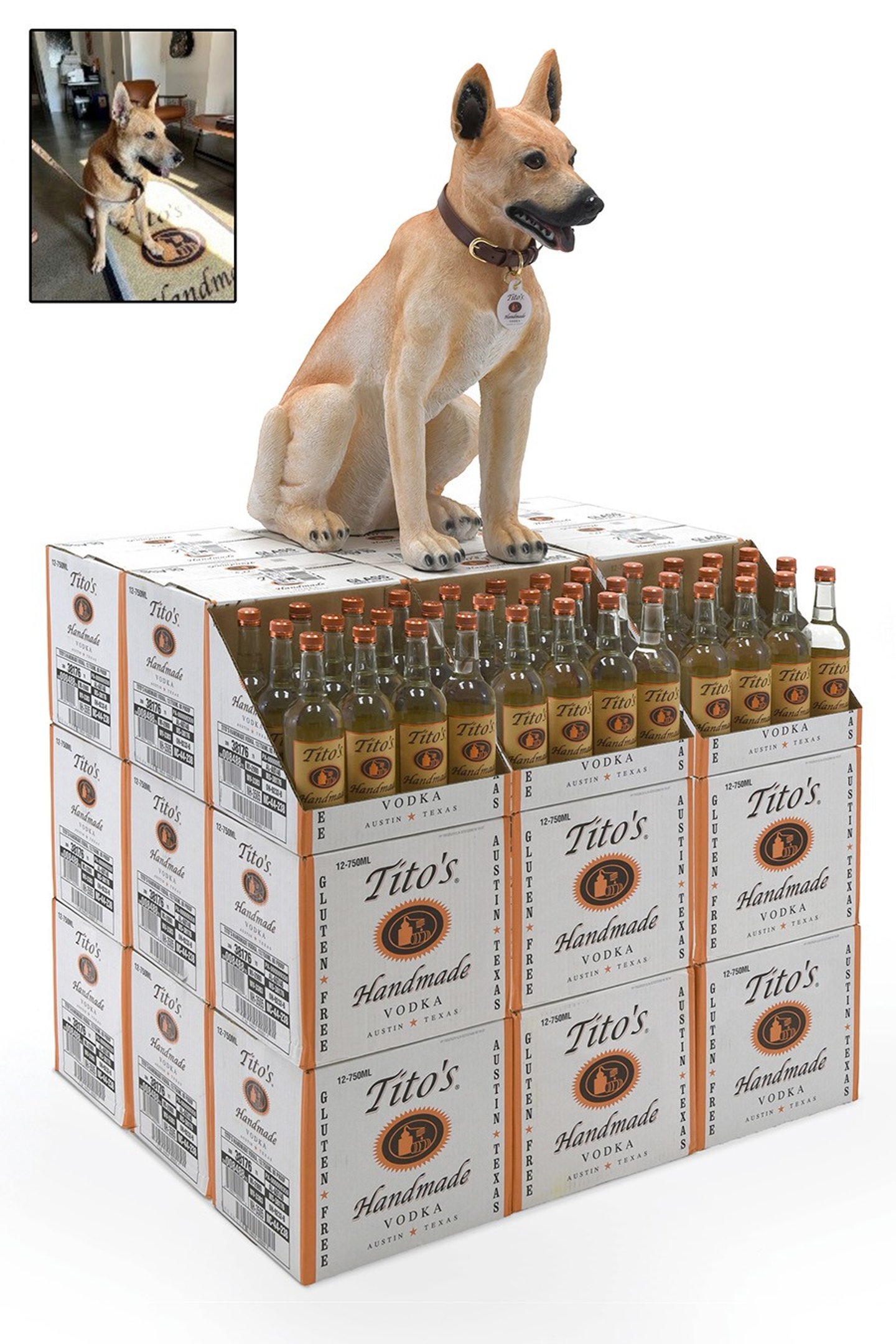
Brand: Tito’s Handmade Vodka
Display manufacturer: Bish Creative
Tito’s Handmade Vodka runs an annual campaign called "Vodka for Dog People." Bish Creative needed to make a memorable display for the campaign that honored Taki, the dog. The display needed to replicate Taki’s personality and expression so that he could serve as an in-store mascot. The hand-sculpted, lifelike display captures the nuances of Taki’s expression and personality. The custom-made dog collar features Tito’s logo as a badge of honor. Once this display was introduced to retail, sales increased by more than 60%.
P2PI perspective: The dog statue creates an immediate emotional connection with pet owners, which can drive impulse purchases. It's a "stop-and-stare" focal point and can encourage shoppers to take photos and share them on social media, providing free organic marketing.
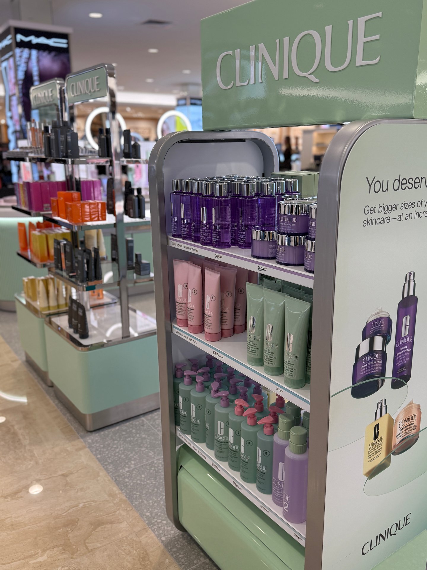
Brand: Clinique
Retail partner: Dillard's
Display manufacturer: All Source+
Created for Clinique at Dillard’s locations, this multistore display tower transforms the brand’s signature mint green into a distinctive retail environment for prestige skincare and cosmetics. All Source+ produced the complete fixture, combining durable metal construction, acrylic components, rounded architectural forms, tiered shelving, product organization, integrated messaging and elevated branding. The compact, high-capacity design supports self-guided discovery and beauty-adviser engagement while giving Clinique a clean, highly visible presence within the competitive department-store beauty environment.
P2PI perspective: The display offers strong brand identification and organized merchandising. There is an effective use of secondary signage that helps educate shoppers. The open-shelf design allows for accessibility and high product density without feeling cluttered.
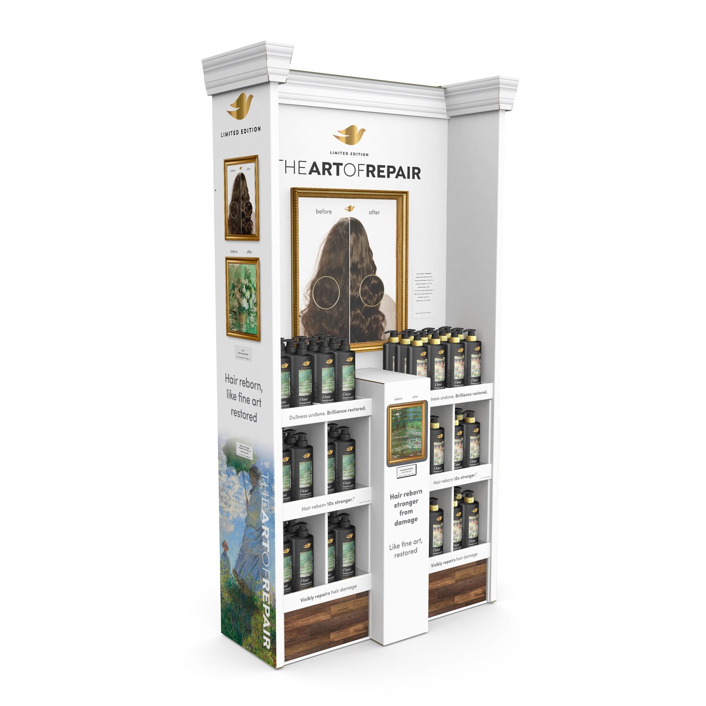
Brand: Unilever's Dove
Display manufacturer: Menasha
Dove’s "The Art of Repair" transformed the aisle into a premium, museum-inspired destination that elevated the Dove brand and its hair care portfolio. Created by Menasha, the limited-edition display drew inspiration from the art restoration process, connecting the precision of hair repair science with the preservation of artistic masterpieces. Through elevated structure, premium finishes and expressive artwork, the activation delivered an immersive shopper experience that reinforced Dove’s beauty and care credentials while creating a memorable in-store brand moment.
P2PI perspective: The elevated messaging transforms a routine purchase into a premium experience. The central graphic uses a clear "before" and "after" that provides visual proof of the product's efficacy. The display maintains high "shoppability" by neatly organizing products.
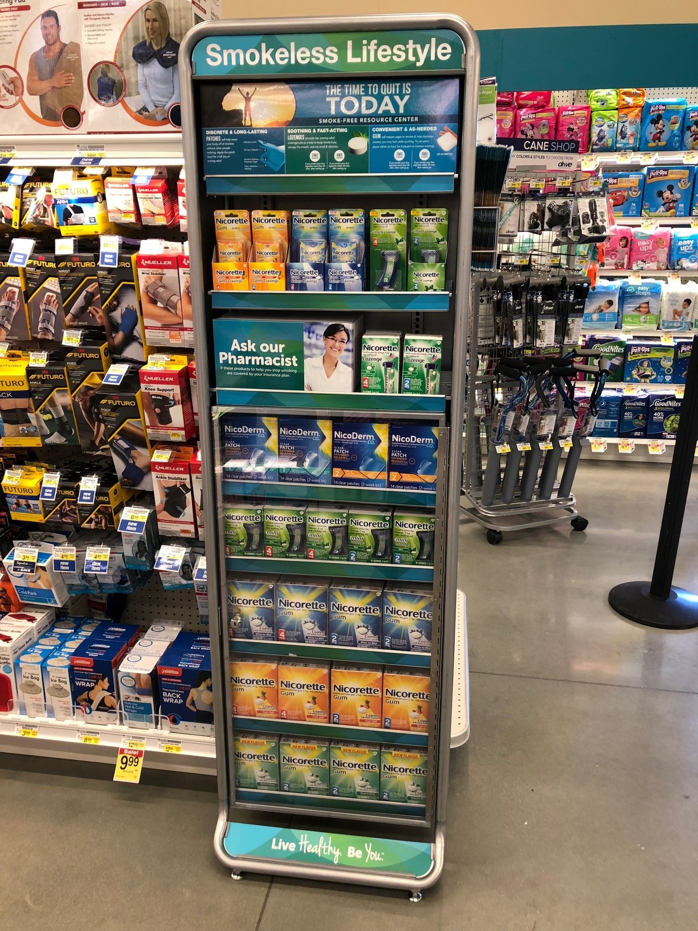
Brand: Haleon's Nicorette
Display manufacturer: Applied Merchandising Concepts
Applied Merchandising Concepts produced a locking security tower for Nicorette smoking-cessation products, keeping a high-theft category merchandised on the floor rather than behind the counter. Most retailers lock the bottom five shelves while leaving the top three open for 24/7 access to lower-cost trial sizes, with take-one brochures offering information and savings. Over an 11-month period, the fixture delivered a 101% increase in dollar sales and 103% increase in unit sales. It remains in market at Albertsons, Kroger and Harris Teeter.
P2PI perspective: The display uses a clear, benefit-driven header, which immediately identifies the category for shoppers. The secondary graphics create urgency with a call to action, while also offering professional credibility. The footer reinforces a positive, lifestyle-oriented message.

Brand: Manscaped
Retail partner: Walmart
Display manufacturer: Bay Cities Packaging & Design
Manscaped preferred an open-format display, so Bay Cities designed multiple floating shelves to accommodate a variety of products. To create a clear focal point, Bay Cities strategically incorporated a standee die-cut lug-on at the center of the display. Manscaped then arranged a photo shoot, capturing the ideal angle and scale so that the imagery fits seamlessly within the display. The gift wrap graphics and holiday background effectively conveyed the gift box opening theme, reinforcing the festive and premium feel of the display.
P2PI perspective: The display has strong seasonal messaging and relatable lifestyle imagery. The design makes it easy for shoppers to see and grab the products. The side-by-side shelving allows for a high volume of inventory to be displayed in a compact footprint.
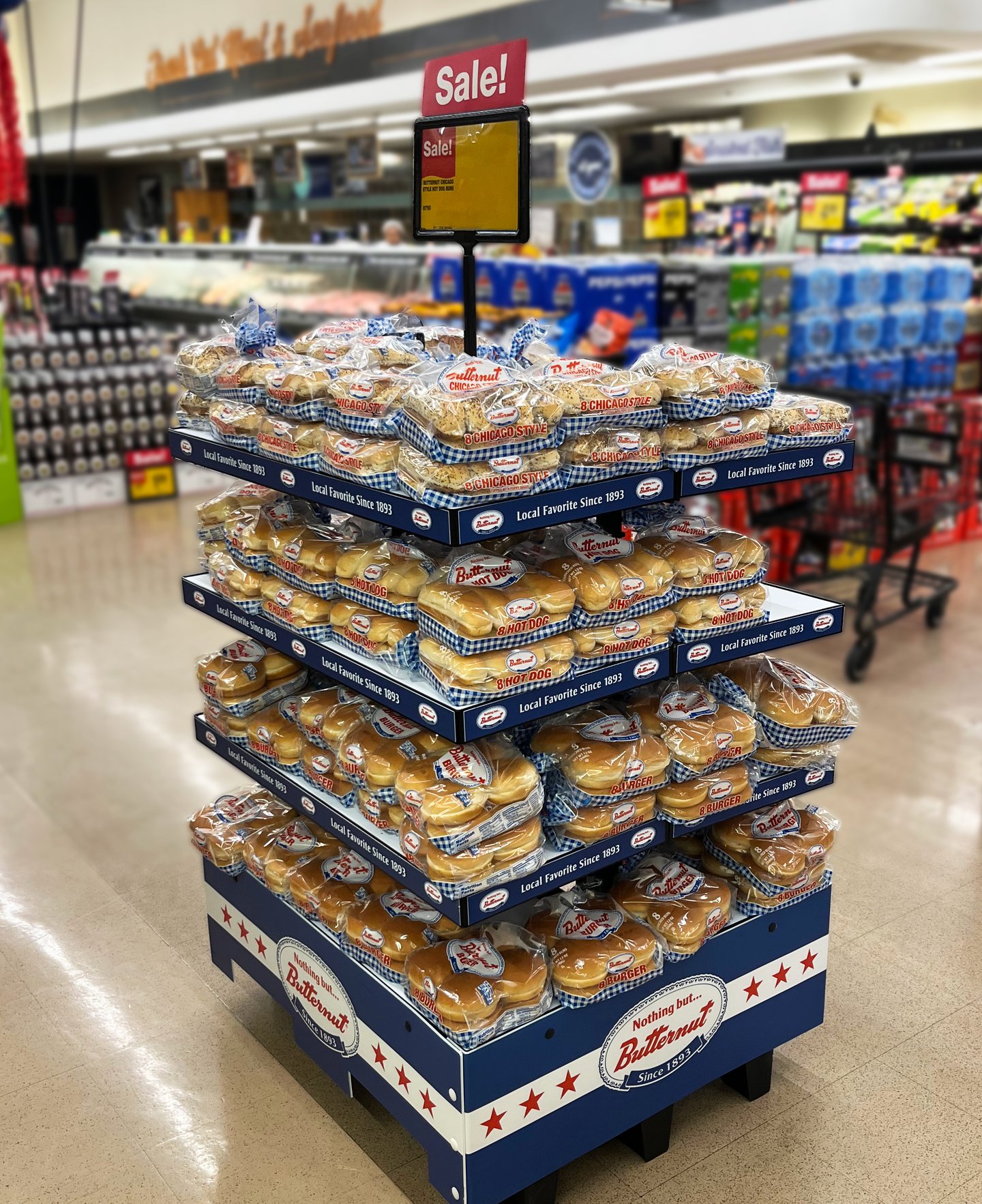
Brand: Butternut by Lewis Bakeries
Retail partner: Jewel-Osco
Display manufacturer: WM Display Group
WM Display Group built a permanent bread and bakery fixture for Butternut, available in 4-foot and 3-foot formats to fit varying store footprints. The four-shelf display features shelf trays, branded shelf-edge graphics and a two-piece wraparound skirt celebrating Butternut's Chicago heritage since 1893. Designed for high-turn categories like hot dog buns, hamburger buns and Chicago-style buns, the fixture consolidates the brand's assortment into one shoppable destination — reinforcing local pride while streamlining replenishment. Displays were built on pallets for easy relocation to take advantage of impulse sales.
P2PI perspective: The base and shelf edges feature consistent blue and white branding, reinforcing brand recognition throughout the unit. The freestanding island pod located allows for 360-degree shoppability. The use of four stacked tiers maximizes the product footprint.