What Brands Can Learn From Hannaford's Private-Label Playbook

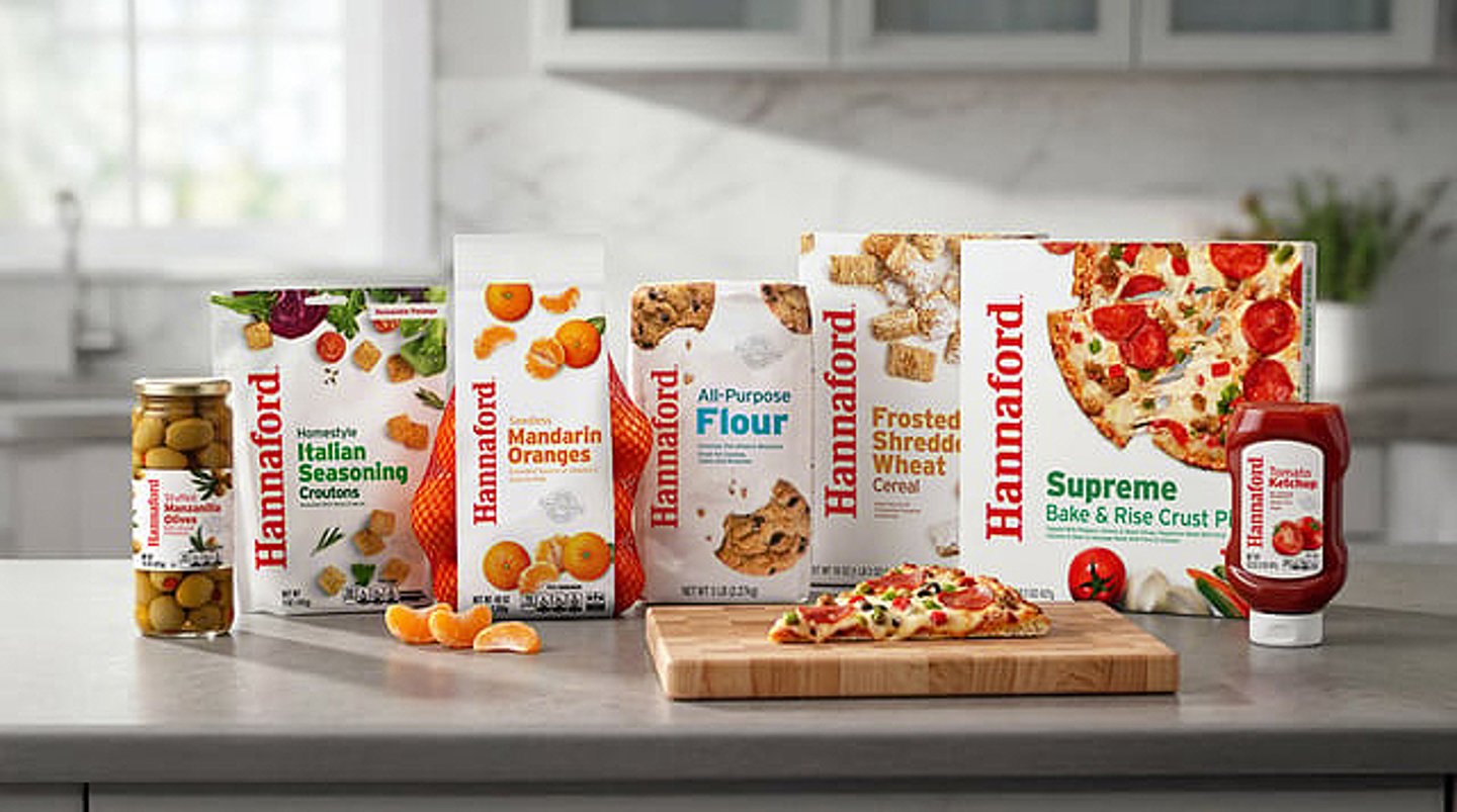
Leadership at Ahold Delhaize USA banner Hannaford Supermarkets recently detailed how internal teams transformed its brand for the better.
Hannaford's Sarah Guzman, VP of brand strategy and marketing, and Ross Mosher, the banner’s VP of center store category merchandising and pricing, showcased the collaboration between category management and marketing teams that brought this vision to life.
What Hannaford learned from the process was that elevating its own brand wasn't just a margin play, but a critical strategy for regional relevance and community trust.
"[Hannaford] is really our foundation," Mosher said. "It represents dependable quality and everyday value across a broad range of products across our assortment. We'd say that it's familiar, it’s accessible, and it ties really closely to that trust and relationship we already have with our customers.”
"A national brand can create loyalty to an item, and it can certainly bring a customer into the category, but the power of the private brand is it can actually create loyalty to the retailer," Mosher noted. "Every time a customer chooses a Hannaford brand product, takes it home and then has a really great experience with it, that experience reflects back on us as the retailer.
"We don’t think about private brand simply as a collection of items or just a lower-priced alternative that’s sitting next to a national brand on the shelf. We really think that it can reinforce what Hannaford stands for and really broaden and deepen that relationship that we already have with our customer,” Mosher said.
Pointing out that value is “not simply an inexpensive option, it’s really that combination of what you paid for the product and then what you got for the product in return, Mosher asserted that “when you can execute consistently on quality and value, that’s where trust can really start to build, and we think that trust is really the multiplier when it comes to private brand.”
Making Worthy Packaging
When Hannaford spent time listening to its customers, it realized that "there was a really big disconnect," as Guzman put it, adding that while "they told us … they trusted the product inside the package[,] … the packaging was not reflecting the quality inside. … They told us exactly what they thought, which was that the packaging was bland, it was a little boring, it was outdated, and in some cases, it felt a lot more like a generic store brand than the Hannaford brand that they know and trusted. So that really became the opportunity: to make the package worthy of the product inside."
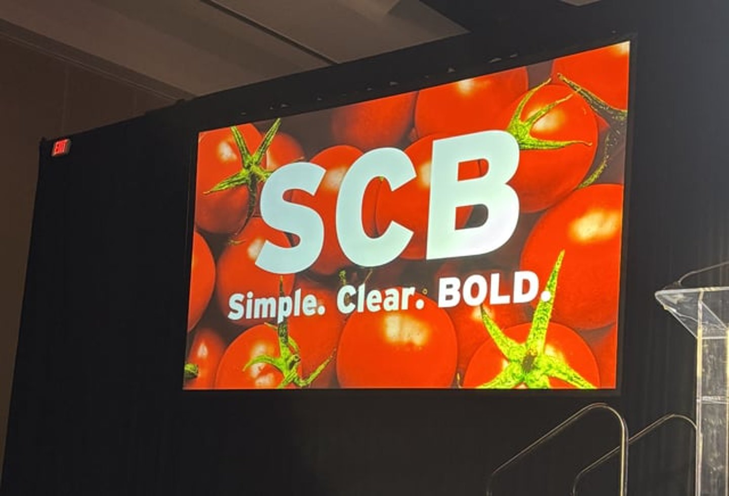
The way the grocer met this opportunity was to keep things simple, clear and bold. "We call this SCB for short, because we reference it so often," Guzman said. "It's what we continually hear from customers. Simple, so they know exactly what they’re getting; clear, so that the information they need most is really front and center; and bold, so that the quality shines through and it’s standing out on shelf as well. This … was not only the framework that we used as we explored the design, but it actually became more of a decision-making filter for us."
Guzman said it has a “strong, consistent … brand identity across many different categories and many different pack structures. There’s a system that kind of creates a recognizable family. And one of the things that we like most and that was difficult to achieve is that all of the products in this portfolio are distinct and yet it doesn’t feel like there's anything repetitive here. They go together, they belong together, but there's still room for each product to be a little unique from each other. The most important thing is when we showed this design back to customers, they told us, yes, this looks as good as the package or as good as the product inside."
Using as the brand’s protein pasta offering as an example, Guzman explained that “the design, when you kind of zoom in, has four key jobs. The first is, it’s got to break through. We all know this, but busy shelf sets, we’ve got to catch the customer’s attention and break through on the shelf. The second, appeal. We can’t emphasize this enough, and we heard it from customers on our prior design, really making sure that the food looks delicious and that the design resonates and attracts the customer. Three, clarity, really making sure that the benefits, the attributes, the information the customer’s looking for is very clearly expressed and easy for them. And then the fourth, value.”
To clearly communicate value, Hannaford put its double-your-money-back guarantee on the front of every package. "The reason we did that is because we really wanted to signal this is quality that we stand behind," Guzman affirmed.
She cautioned, however, that applying the SCB mindset "across a complex portfolio required a lot of choices. And in some cases, that meant removing things that just weren't adding value to the customer … and it also required a lot of conversations between functions and partners to really look at how this brand came to life across the entire store and working to get it to be consistent."
An Integral Experience
Great packaging is only going to take us so far in terms of achieving Hannaford's goals, Guzman said.
To create a stronger emotional connection with shoppers and drive private-brand growth, it has to be thought of as more than just a packaging redesign — it's an end-to-end experience, Guzman said.
"From the merchant side, that just really all begins at the shelf," Mosher said. "So, if we truly believe that the products that we have deliver that strong quality and value that we're promising our customers, then we need to make sure that customers recognize that at the point of sale and on the shelf. That means creating visibility, things like creating brand blocks in our stores, making the value really easy to understand."
This past summer, Hannaford launched a new Two Ways to Save campaign, which simplified its promotional structure. "Anything that’s on sale, no matter what kind of promotion it is, we’ll have a 'Save Now' sign, and then everything that’s a great value every day, we’ll use the 'Everyday Low Price' sign," Mosher said. "Wherever customers encounter our brands, we want to make sure that the quality and the value are coming through loud and clear."
The banner is also leveraging all of its marketing channels to make sure that it's talking about private brand in various ways. Guzman noted, "It's really about making it integral to the Hannaford experience," which Mosher emphasized shoppers cannot get elsewhere.
Mosher and Guzman concluded with four lessons learned from the process of refreshing Hannaford’s brand identity:
- Find your strength and start with that.
- Let the customer lead.
- Stay true to the brand.
- Activate it across your entire system.
"Don’t ask what role private label can play in your assortment," Mosher said. "Ask what role it can play in your retail brand."