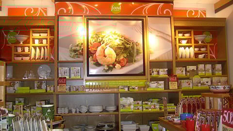
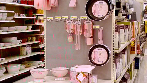
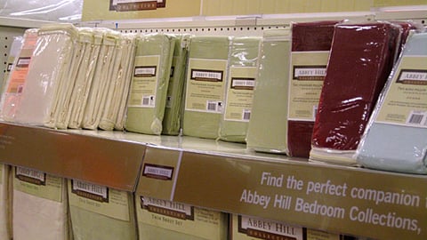
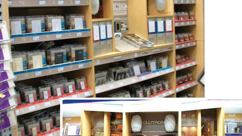
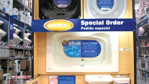
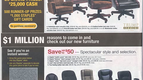
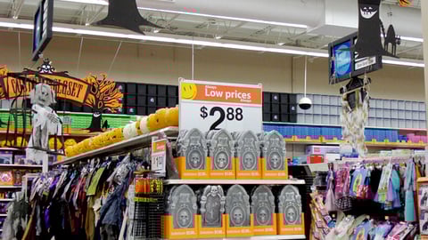
Kohl's Food Network Cookware Wall Display Bialetti Pink Edition Cookware Endcap Retailer: Target Location: Colorado Springs, CO Kmart 'Totally Ghoul' Doll Endcap Kmart Abbey Hill In-Line Merchandising Lutron Dimmers and Fan Controls In-Line Lowe's Jacuzzi Endcap Wal-Mart Refashions Ads, Apparel Merchandising Staples 'Rich Possibilities' Feature Wal-Mart Halloween Inflatables Mechandising Wal-Mart 'Costume Closet' First Previous 360 361 362 363 364 Next Last