
P-O-P Showcase
Manufacturer: Bish Creative
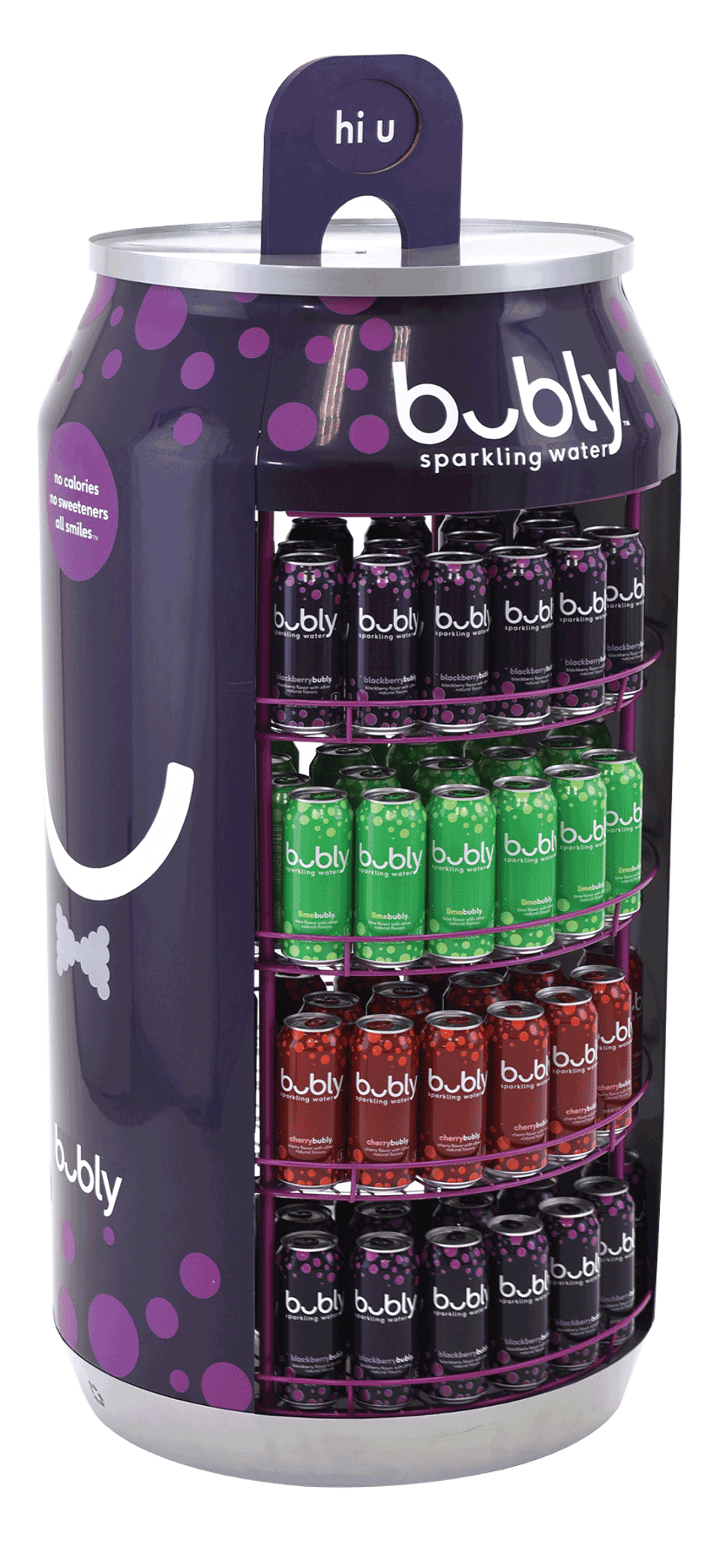
Bubly has quickly become one of the top-selling products in the PepsiCo portfolio. Launched as a fruit-infused sparkling water, this product line has single-handedly risen to the top of the sparkling water category. Bubly is all about smiles, and each can offers a clever phrase with a smile and a message as a consumer opens the product. For example, the Blackberry flavor includes the phrase “hi u.” Bubly needed an attractive display to launch its new 16-ounce, single-serve cans. As part of a render to reality program, the authenticity of the display needed to carefully match this now well-recognized can. The display targeted all consumers and was used successfully in food service, airport locations and convenience stores. Bubly’s No. 1 seller, Blackberry, became the focal flavor of the display, which was carefully engineered to ensure it held a significant amount of product to provide an ROI to the store or establishment. A vacuum-form replica of the can surrounded the display, along with a vacuum-form cap and laser-cut wood for the pull tab. The bright blackberry-colored finish made the display recognizable during the product launch, and now with Bubly seeing greater distribution, the display serves as the sole vehicle for incremental sales in delis, convenience stores, airport concessions and food service entities. Delivered to the stores fully assembled, retailers immediately saw a return on investment when employing this display.
Results: As the brand continues to be one of the fastest-growing sparkling waters on the market today, the display has seen a sales lift of more than 200% when placed in strategic parts of the store.
----------------------------------------------------------
Manufacturer: Visual Branding
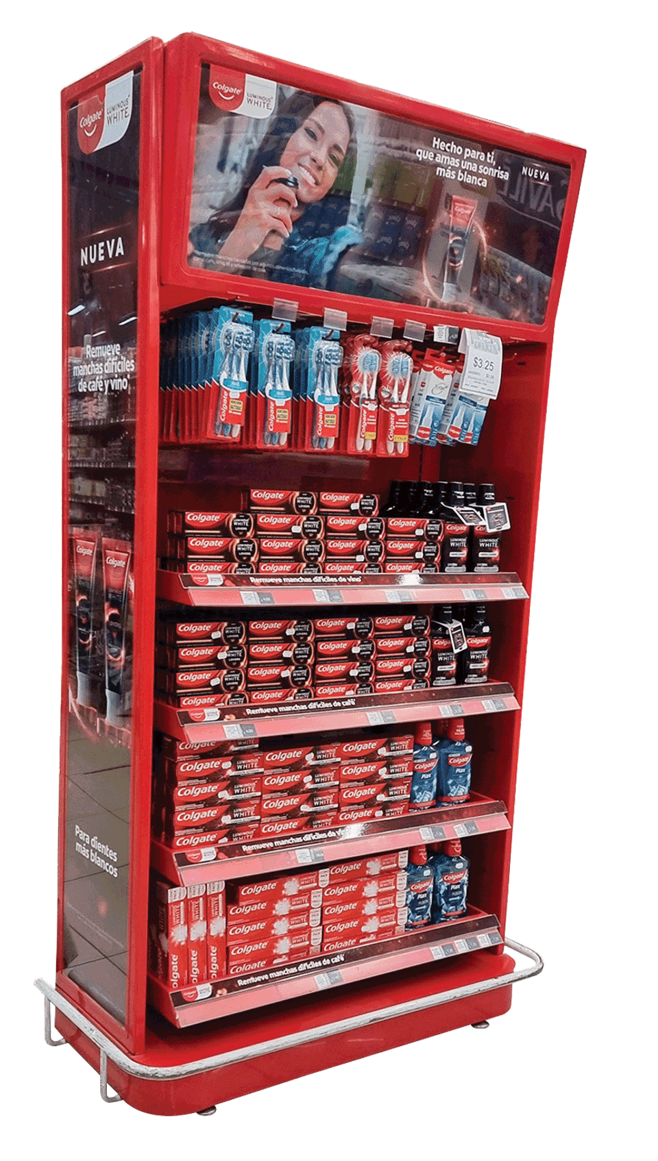
Colgate Palmolive — Centro America wanted a unit that would have an impact for different sales initiatives and Colgate product launches. Versatility was needed in this program, so the result was an adjustable planogram system in this endcap structure. Placed in retail locations in Guatemala, El Salvador, Honduras, Nicaragua, Costa Rica and Panama, the attractive and versatile endcap for retail is durable and fits Colgate’s different sales initiatives and product launches. It employs compatible parts including hooks for toothbrushes or trays for products, such as toothpaste or mouthwashes, that can be placed in the unit. The hotspot can be placed in the most convenient position or removed to maximize dispensing. The side pieces have interchangeable graphic communication, but it also has a rotating system that turns the side into another business unit, allowing it to dispense more product. The endcap can be as customized as the showroom needs, while remaining a standard design for production. With only adjustments in planogram and graphics, it is possible to have a different design, adjusted to the objective of each campaign.
Results: This unit increased sales results by 40% and since it was implemented, Colgate has launched at least three different campaigns, some specific to points of sale or countries.
----------------------------------------------------------

Manufacturer: Great Northern Instore
This Logitech/Office Depot display features edge-lit acrylic to make the display look like it is lit with LED lights for the demo area. Also boasting bright colors, it easily attracted consumers from across the store. The company engineered the display to be structurally sound and hold the weight of the product not only in store, but also during shipment.
Results: Logitech had a sizable sales increase year over year, selling upward of 38% more product after putting the display in stores. The design and promotion were so well received, the company has plans to create and place similar displays for other seasons.
----------------------------------------------------------

Manufacturer: Great Northern Instore
In an effort to showcase the product, this solution became an opportunity for Heaven Hill Brands to incorporate its process for charring bourbon barrels and how the char level impacts the product. Actual staves of the barrels became the focal point of this display. The eye-catching and durable display made a statement in-store, highlighting the Elijah Craig Bourbon. Additionally, it only took four steps to assemble the display in retail locations.
Results: Heaven Hill Distilleries and retailer Total Wine saw significant sales increases from the display. On average, retailers saw an increase of more than 40%, with some markets seeing a 60% increase year over year.
----------------------------------------------------------

Manufacturer:
Visual Branding
Mexico City-based Coca-Cola Femsa S.A. needed a durable and resistant solution to strengthen its position in traditional retail locations in Guatemala, while also increasing sales. The unit was designed to merchandise three standard boxes of Coca-Cola bottles. It had to be easily mobile at the point of sale, practical for dispensing the product and with graphic communication of the brand. The solution is focused on high resistance and optimized cost, to obtain greater coverage of commercial distribution, but with the same budget. The design of the trays allows easy dispensing of each bottle and refilling product is more practical because empty boxes are exchanged for others with new product. At the same time, its functionality as a pushcart allows the display to move easily and with high rotation, even though it is full of heavy product. The design company used electrostatic printing and painting systems that resist wear over time, and an interchangeable printing system was included in the header.
Results: Coca-Cola saw a greater brand positioning in traditional retail in Guatemala, and even though its competition had greater coverage in this distribution channel, with these 2,500 displays placed in strategic points of sales, the brand strengthened its positioning and has exceeded its expectations in sales.
----------------------------------------------------------

Manufacturer: Bish Creative
Outdoor activities have been on the rise for several years, and today’s consumers want a balanced lifestyle that includes their favorite outdoor adventures. Enter Proximo Spirit’s Tincup whiskey, named after an old mining town in Colorado that got its name from the cups miners would drink from. The authentic American whiskey has seen its own success over the past several years, in part because of its unique pentagonal-shaped bottle with a tin cup shot glass as the cap. Tincup whiskey has become the choice of more outdoorsmen, whether fishing during the summertime or during the winter in a shanty. This whiskey display mirrors a shanty, complete with a front porch, rocking chairs and fishing rods, visually helping consumers picture themselves fishing near a lake, river or pond. The brand stands for relaxation and enjoyment, and the blended whiskey is popular with young adult consumers between the ages of 25 and 35 who love the outdoors. Being one with nature and enjoying a fine whiskey is what Tincup emulates in all of its merchandising displays.
Results: This retail theater approach to marketing helps guide the consumer to the brand — and sales have grown substantially each year, with case stackings also increasing 50%-60% for retailers that use these displays as the focal point for the craft whiskey category.
----------------------------------------------------------

Manufacturer: Bay Cities
Walmart and P.K. Kinder Co. executed a “Summer Grill” promotional half-pallet display to showcase Kinder sauces, rubs and seasonings during the holiday season — just in time for Memorial Day. The unit was designed around the focal point of Kinder spices while highlighting the longevity of P.K. Kinder Co.’s “Award-winning flavors for over 70 years.” A convenient QR code was included in the design to provide an array of recipe options to choose from to feed family and friends in celebration.
Results: From concept to installation, the partners pulled off a successful retail display to run through the summer season, with a final push through September for National Spice Day.
----------------------------------------------------------

Manufacturer: Bay Cities
Walmart and Moose Toys came together to deploy the retailer’s “Toy of the Year” retail display. With its design created specifically to resemble an actual cauldron, it required a great amount of care regarding the assembly, as well as the logistical challenge of shipping the unit.
Results: The Disney-like showpiece sold out of product soon after arriving in retail locations. In the end, the product and the display were the tandem elements of a successful retail display campaign.
----------------------------------------------------------

Manufacturer: Innomark Communications
This two-sided pole display was designed to drive sales for New Belgium Brewing Co.’s Mountain Time beer, while highlighting its partnership with the Colorado Avalanche. Its hexagonal structure, angled hockey sticks and Mountain Time cans add dimension, enhance branding and create visual interest in-store. Meanwhile, lug-ons communicate prize package details and further link the brand to the excitement of professional hockey.
----------------------------------------------------------

Manufacturer: Innomark Communications
This holiday-themed pallet program was designed to drive sales for multiple brands, while highlighting PepsiCo’s partnership with Toys for Tots. It includes a front tunnel with a freestanding train, as well as a back piece with a printed caboose. Retailers can adjust the space between the front and back pieces to accommodate one, two or three pallet floor sets.
----------------------------------------------------------

Manufacturer: WestRock
Walmart sought to improve the overall paint shopping experience in stores. The solution was to engage the shopper with a display that offered a simplified color palette, which matched up with the in-stock inventory for easy self-service. The Walmart Better Homes & Gardens Color Center display from PPG Architectural Coatings was 100% fiber-based for sustainability and cost savings. The color swatch pockets, normally molded from plastic in this display, were engineered to be made of paperboard. This saved the cost of manufacturing new molds for the new size of the color swatches. Overall, this temporary solution costs roughly one-third as much as a permanent material version would have cost. The production time was reduced from eight months for the traditional permanent unit to 10 weeks for this temporary solution. The concise, simplified color palette — including the top, most usable colors — matched up to ready-made colors immediately available on the shelf. A scannable code printed provided access to additional online shopper resources. Since the display could be set up by one person, the solution realized labor savings as well at retail.
----------------------------------------------------------

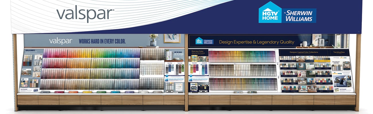
Manufacturer: Innovative Marketing Solutions
The objective of this color wall was to consolidate two distinct paint brands, Valspar and HGTV Home by Sherwin-Williams, into one cohesive category presentation while allowing each brand to have its own character and identity. The goal was to have this presentation act as a beacon to attract attention and draw consumers into the paint department at Lowe’s stores. The color wall is crowned with a dramatic tidal wave graphic that blends the two logos into one seamless, flowing brand statement. Each brand is then supported and delineated by a 16-foot-long subheader graphic featuring a freshly painted room scene along with a thoughtful tagline to inspire DIYers. Color palettes are positioned below and segmented for maximum visual impact, while allowing customers to quickly and easily find the perfect color for their project. The entire organization of each color presentation is balanced to reinforce the overall unity of the color wall. Bold, eye-catching colors and graphics grab shoppers as they enter the store. All display elements ship on two oversized skids, limiting freight costs. Each component was engineered to be easily assembled in-store and replaceable over time, if needed, and all graphic panels can be individually updated. Base drawers provide color chip and literature storage, along with detailed wayfinding to facilitate inventory organization and restocking.
Results: The initiative has seen great reception and increased sales within Lowe’s.
----------------------------------------------------------

Manufacturer: Innovative Marketing Solutions
Born from the spirit of Bolle Brands dba Spy Optics’ Spy brand with its cutting-edge “Sci-Fi” vibes, this obelisk-like design acts as the ultimate cool-space merchandiser. The display features a brushed-metal base with laser-cut logo details. It is topped with a sleek, locking display case. Custom display hardware is mounted on an interior acrylic panel, creating a floating effect for the product displayed. The Spy logo appears to be “carved” onto the base to create a more dramatic branding statement, and the mirrored bottom reflects the ambient light from the store, and shows off the colors and shape of the frames. Showcasing six pairs of Spy’s newest sunglass design, the Monolith guarantees recognition from shoppers that a new and exciting product is being introduced to retail.
Results: The displays have been in the U.S. since Q4 2021 and have exceeded the client’s expectations. The customer is very happy with the interest this “showstopper” has garnered at the point of sale with consumers and retailers alike, and retailers appreciate the ease of assembly (the display ships in two parts and locks into place automatically).
----------------------------------------------------------

Manufacturer: WestRock
Intending to bring Dr. Squatch to life for shoppers in the natural and organic health section at Walmart, the various components for the launch consisted of an endcap, power wing and an inline shelf display. The endcap utilized the humorous elements from some of the brand’s video ads for strong visual impact. With a 48-inch inline section in the category, the company designed a permanent unit replicating a quarter section of a fallen log to support the brand’s natural, outdoors identity. Die-cut hand graphics act as aisle violators, and a removable corrugated graphic block allows the additional product to be loaded, adding even more flexibility and future-proofing of the unit. Two versions were produced of the inline unit: a 10-inch-deep version and a 12-inch-deep version to accommodate different retail shelf dimensions. The power wings provided additional product exposure for the retail launch and the flexibility of placement.
Results: The Dr. Squatch brand became the No. 1 selling soap at Walmart during this retail launch.